The Problem
Gallup’s 2013 report “State of the American Workplace” found that from an interview pool of 150,000 workers, 70%, are disengaged and miserable in their jobs. Employee engagement has long been an internal issue for large corporations; engaged employees display greater initiative, work more creatively and strive to do the best work they can. The release of the Gallup report highlights the need for focus on real-time feedback and understanding of employee engagement,
Project & Process
I was part of a team of three. We completed the design and prototype in 18 days. The process included:
- Research – user interviews; domain, competitive/comparative and current task analysis, personas, user scenarios, stories, card-sorting survey, customer journey
- Planning – brainstorming, initial sketching, layout, storyboarding
- Designing – concept map, task analysis, user flow, site map, initial Balsamiq wireframe
- Prototyping – clickable prototype with Axure, user testing
The Ask
Due to this need, Squawk Metrics employed us to design the first digital prototype, a mobile app, of a physical team collaboration tool they use in their Design Thinking practice, Kiwi Dial.
Background
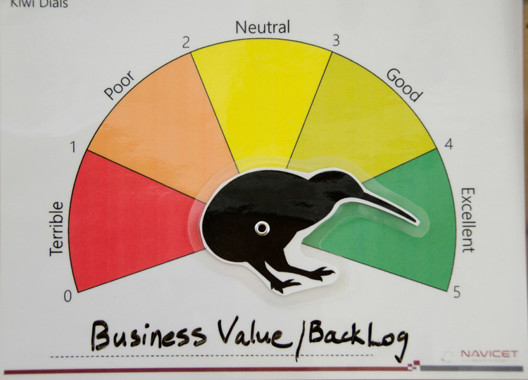
Originally a laminated scale, Kiwi Dial is intended to be displayed in a common area. Anyone can move the dial at any time, anonymously or not, and share their opinion of the aspect of team health that the team might be measuring. Teams have found the Kiwi Dial to be informative, useful and fun. Making the Kiwi Dial digital creates the opportunity for a variety of metrics to be collected and measured. Because team health is highly correlated to success, companies can use the data collected to identify projects that are at risk of future failure and intervene while there is still time to change the results.
The Research
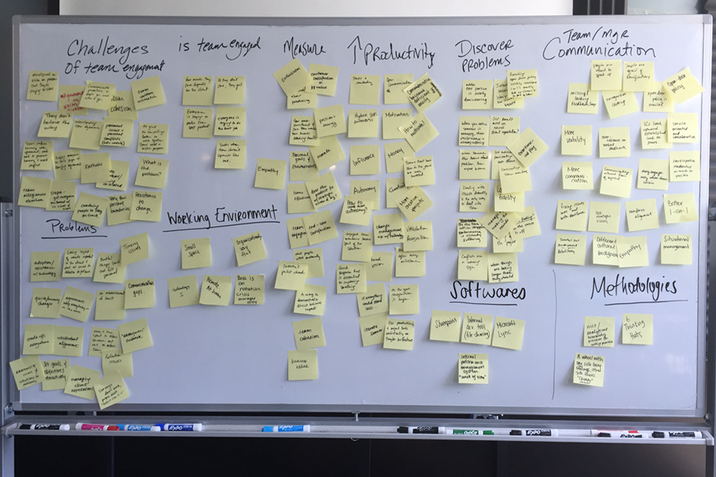
In the Research phase, 11 user interviews were conducted: five at the Senior or C-level, three with team members and three with those who spanned both management and team member roles. Several themes emerged from the interviews and the affinity diagram: the challenges of team engagement, discovering problems, and increasing productivity to name a few.
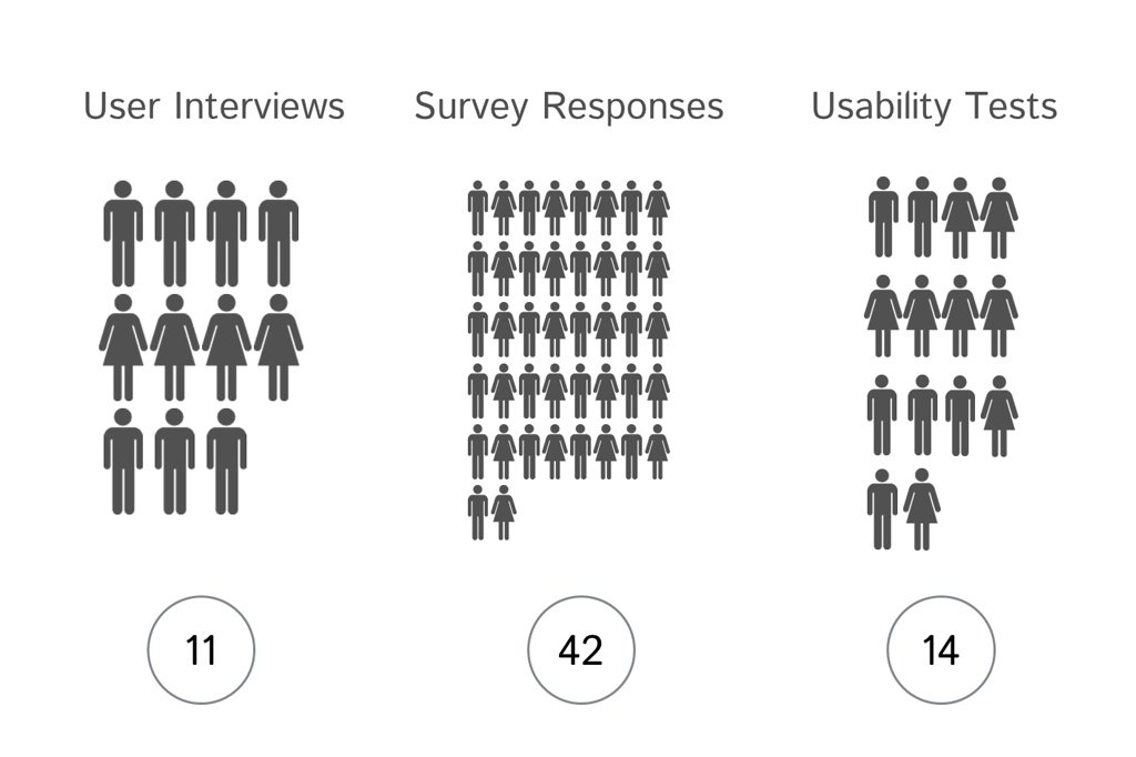
We received 42 responses to a 20 question survey. The main insight we discovered was that over 72% of people do not trust that anonymous surveys are anonymous. This became a challenge to our design. Anonymity must be protected, otherwise employees won’t participate or they won’t be honest; both of which invalidate any metrics collected.
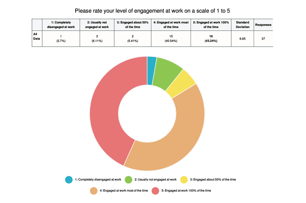
Affinity Diagram
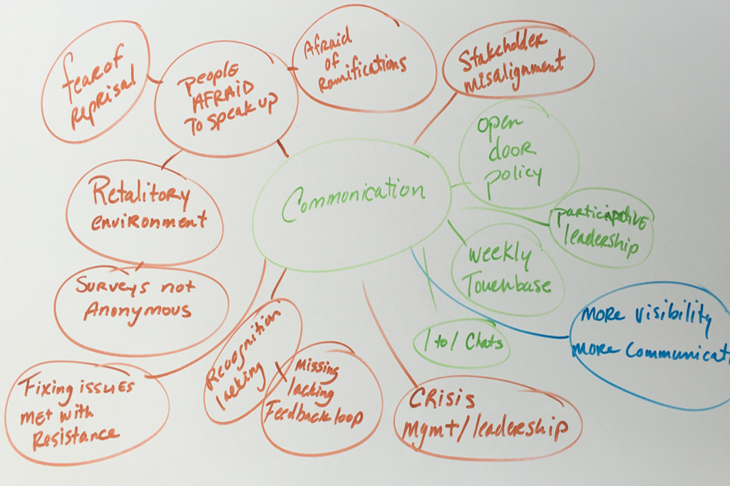
Mind map of themes
Moderator Persona
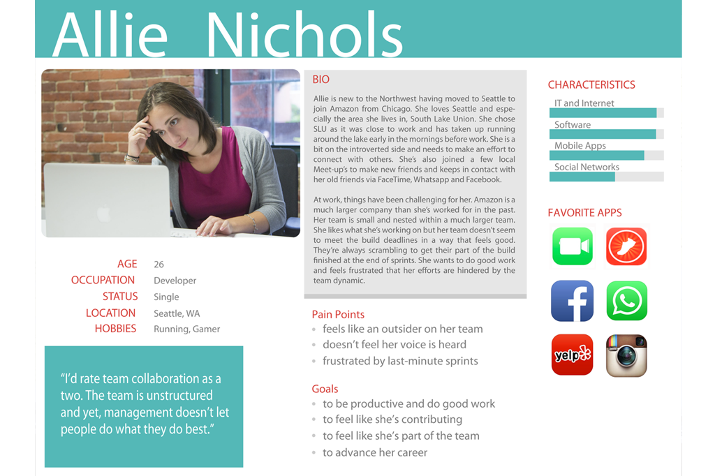
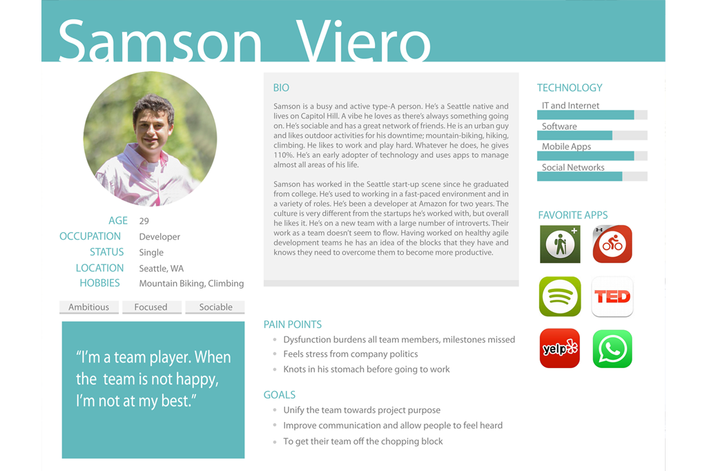 Employee Persona
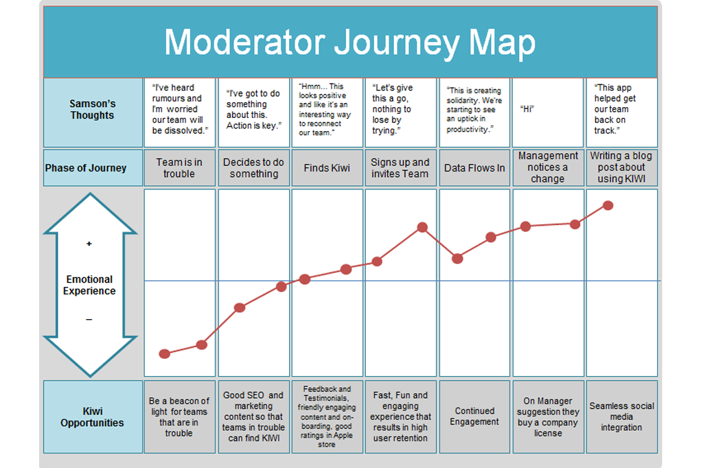
Moderator Journey
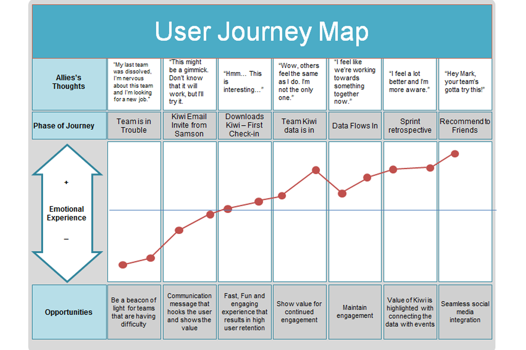
Employee Journey
Planning & Design
Our client was excited about the insights Kiwi would give management and from their point of view, management was their user. They intended Kiwi to be a way for employees to give feedback on any aspect of a project that the team wished to measure: fun, autonomy, progress, team solidarity, impact, clarity of purpose and so on, allowing management to then use the metrics to improve team dynamics, employee satisfaction and retention.
In our opinion, the employees were the users, not management. Kiwi’s viability is undermined if employees are unable to trust their opinions are safe and won’t be used against them. Our design needed to safely give voice to our users, maintain anonymity and alleviate the fear of retaliation. We created guiding principles to inform our design decisions and create a structure from which Kiwi operates.
Kiwi Tenets
Kiwi builds trust and solidarity within a team
Kiwi empowers and gives voice to the individual
Kiwi is a unification tool, allowing teams to do their best work.
Kiwi is dedicated to equality and anonymity.
Kiwi provides continuous objective insight.
User Flows
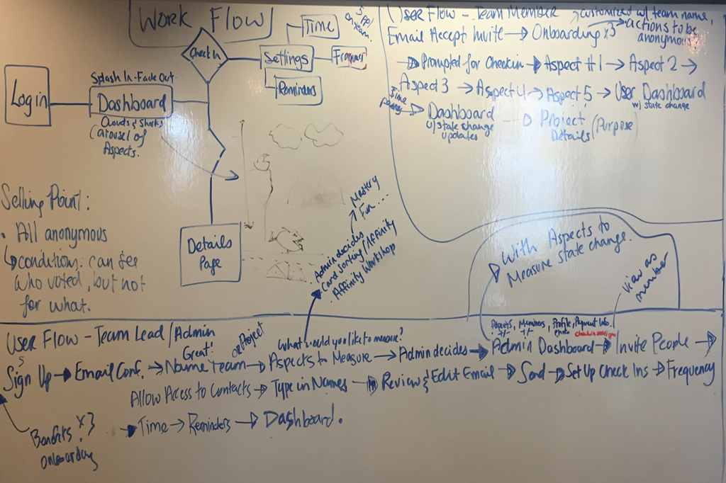
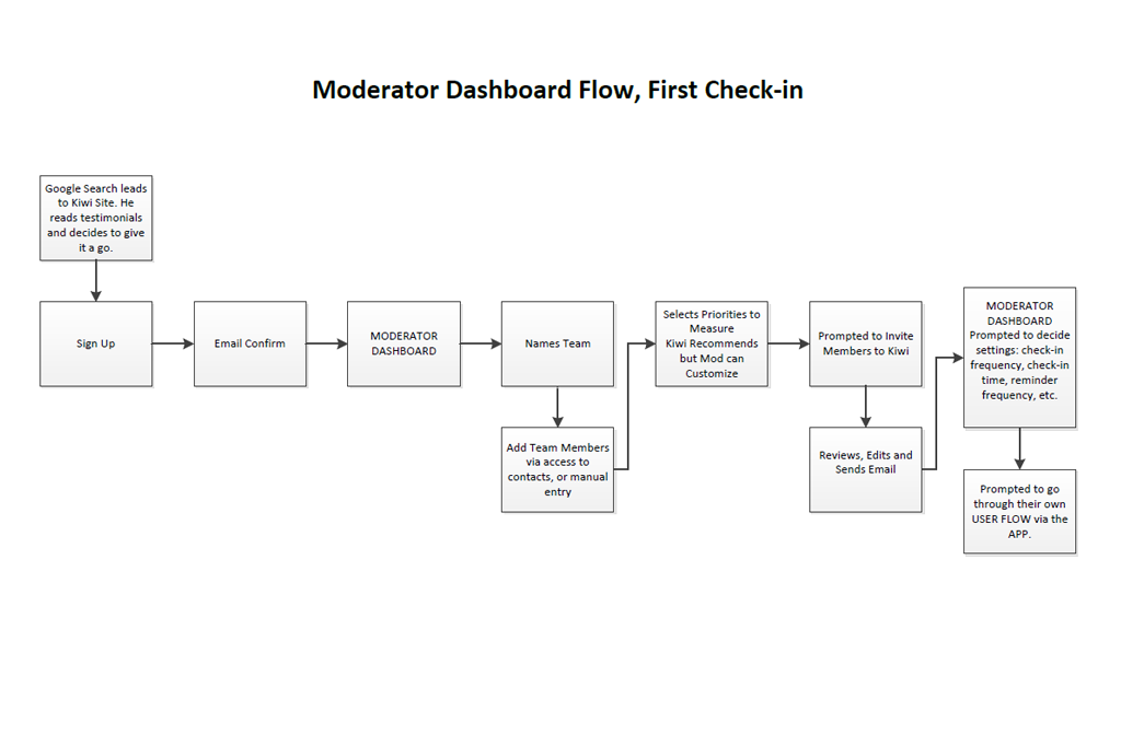
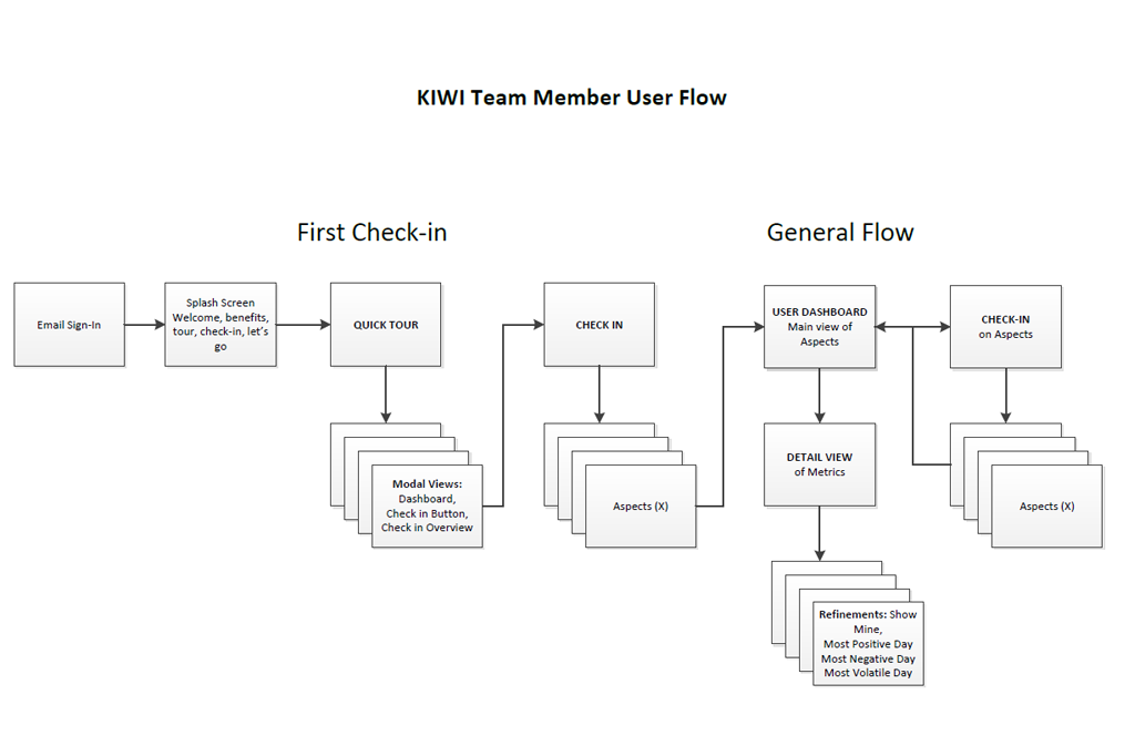
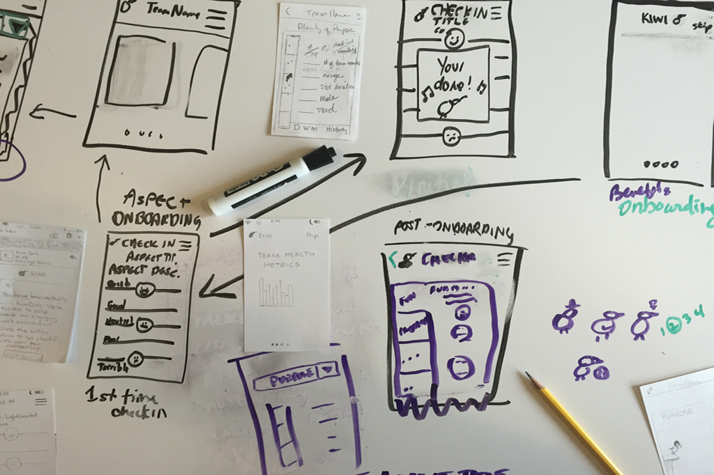
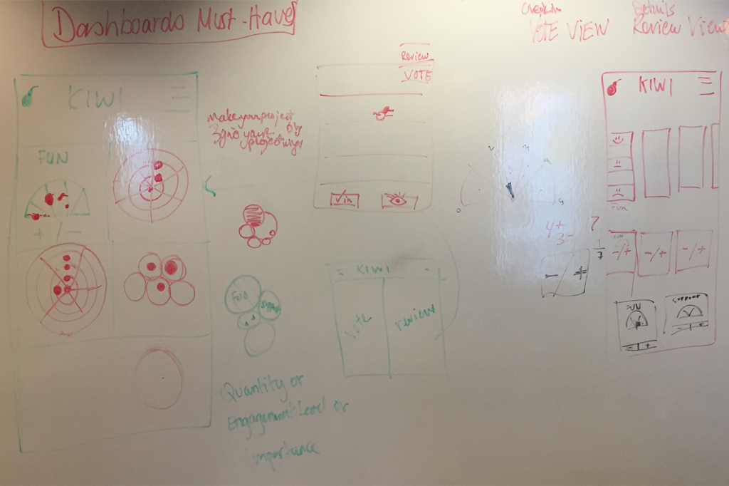
Design sketching
Prototype and Testing
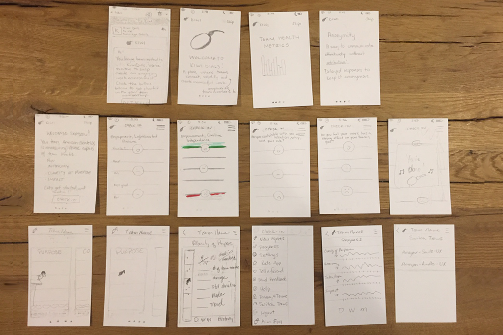
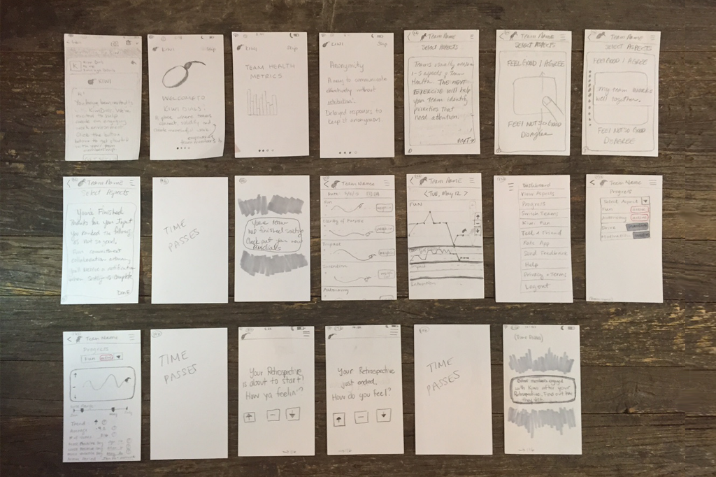
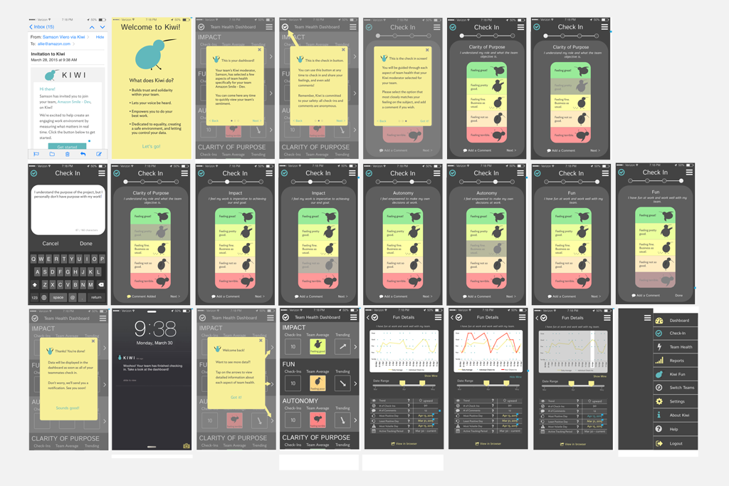
In the prototyping phase we held 14 Usability tests and iterated seven times based on those findings. Initially, we created two paper prototypes that we tested with users, taking the best of what we learned from those two flows to create a third, which then became our first clickable Axure prototype. We continued testing and iterating creating the final version, a strong foundation from which the client will built their first full prototype and ran a pilot test.
Prototypes
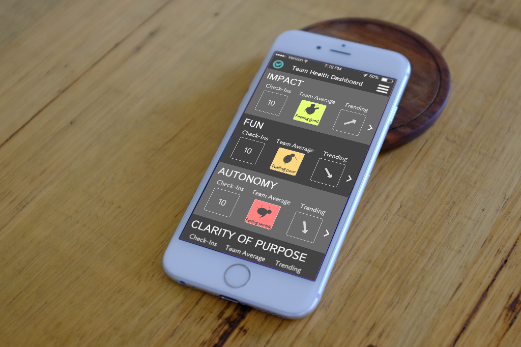
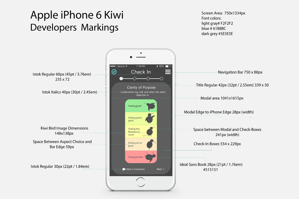
Final Design
“I had a very specific idea of how this would be used, and I see I’ve got to let it go; you’ve shown me a different direction.”
– client quote
“We had done a design prior to approaching you, but your team really took the design in a different direction. You uncovered so many things in your research, like fear of retaliation, this has really guided us in moving forward.” – client quote
Metrics
Kiwi Dials is measuring and showing employee satisfaction in real time. One dial can be compared against another, or an average over time can be shown; both give great insights. Kiwi Dial gives the ability to express opinions that are immediate feedback for the team. This in turn causes quick change that is typically seen as a rise in morale or other positive changes in behavior.
Solution – Kiwi Dials Today
Kiwi has been through many iterations, development and testing and is available in IOS, Android and Windows Phone formats. The UI has changed, but the underlying architecture, requirements and much of the design we created in the first iteration are still in use. The client embraced the employee as their user, and for us, this is a huge win.
