Career key licenses their online career assessment technology to academic institutions allowing counselors to guide students through the career assessment and career choice process.
The Ask
Evaluate and improve the flow of the purchase process.
The challenges
- Client wanted to accommodate the custom needs of all their buyers in the shopping flow
- Development team was offsite in Nepal
- Client’s budget didn’t allow for usability testing
The Process
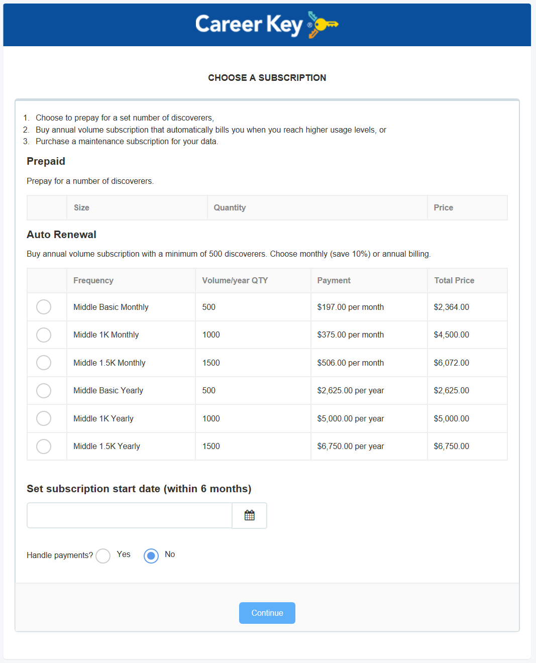
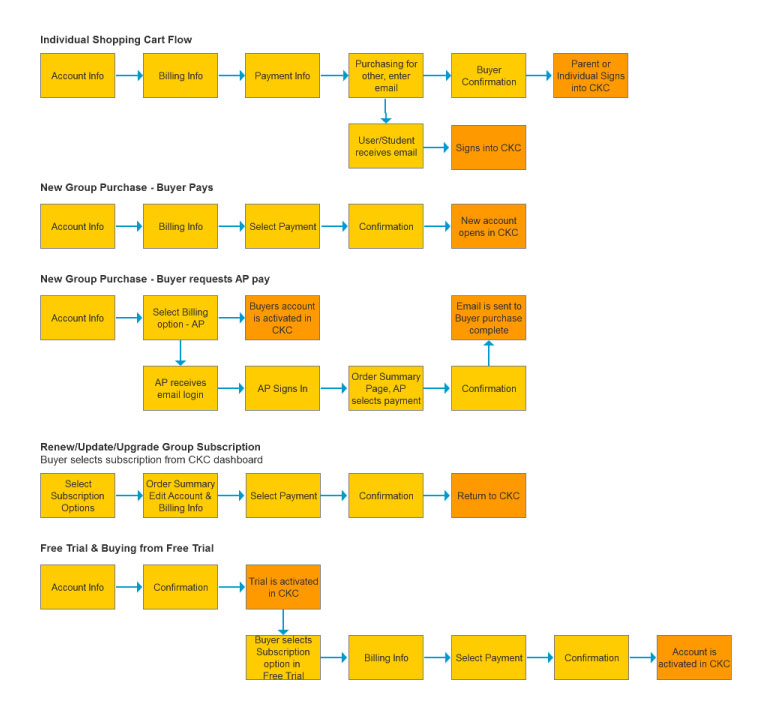
Career Key has a portal called Career Key Central in which counselors use a dashboard to track students through the assessment process. There are multiple user types, several buyer flows, multiple price selections, clients in foreign countries and offerings for both secondary and higher education, creating the need for a shopping cart and process that could handle this diversity.
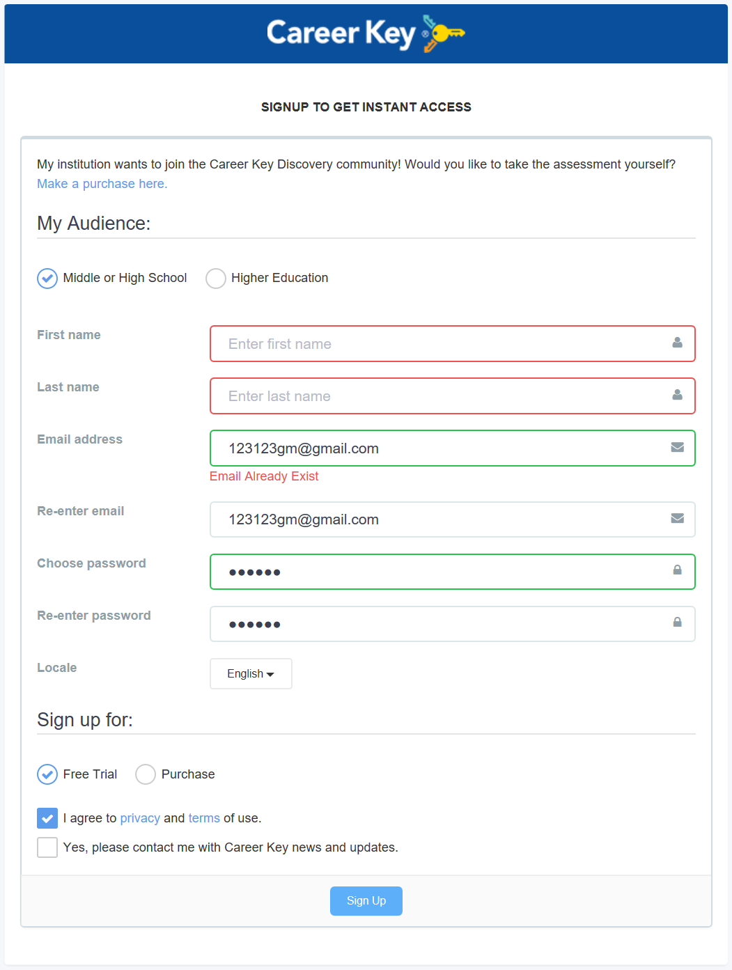
I started with a heuristic analysis of the current shopping cart flow and gathered requirements. On the surface the current shopping cart seemed minimalist, but it was frustrating to use, had many holes and a fatal flaw. The process started with a login, and new user sign up. Once in the cart, the flow did not follow a logical sequence, but worst of all, if a user needed to go back to a previous screen, they couldn’t. Instead they would have to abort and start the entire process over from the login page. At this point, they would be denied access with an error that the email already existed, but yet, they hadn’t finished the process, so they couldn’t use it to login. They were stuck in limbo and would have to start the process using a different email.
Original Shopping Cart Screenshots & User Flows
Solution
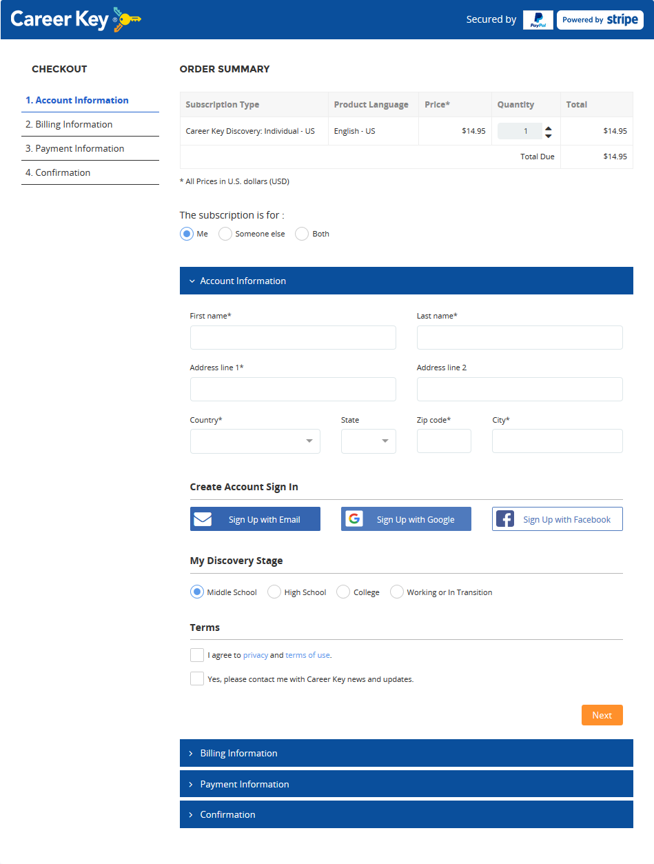
I created wireframes for a new design distilling the shopping cart process down to four screens; Account Information, User Information, Billing Information and Confirmation. Selection variations were created for the Individual buyers and Group buyers. A progress indicator was added allowing the user to understand where they were in the flow, and the ability to go from step to step in either direction was implemented.
Wireframe Iteration 01
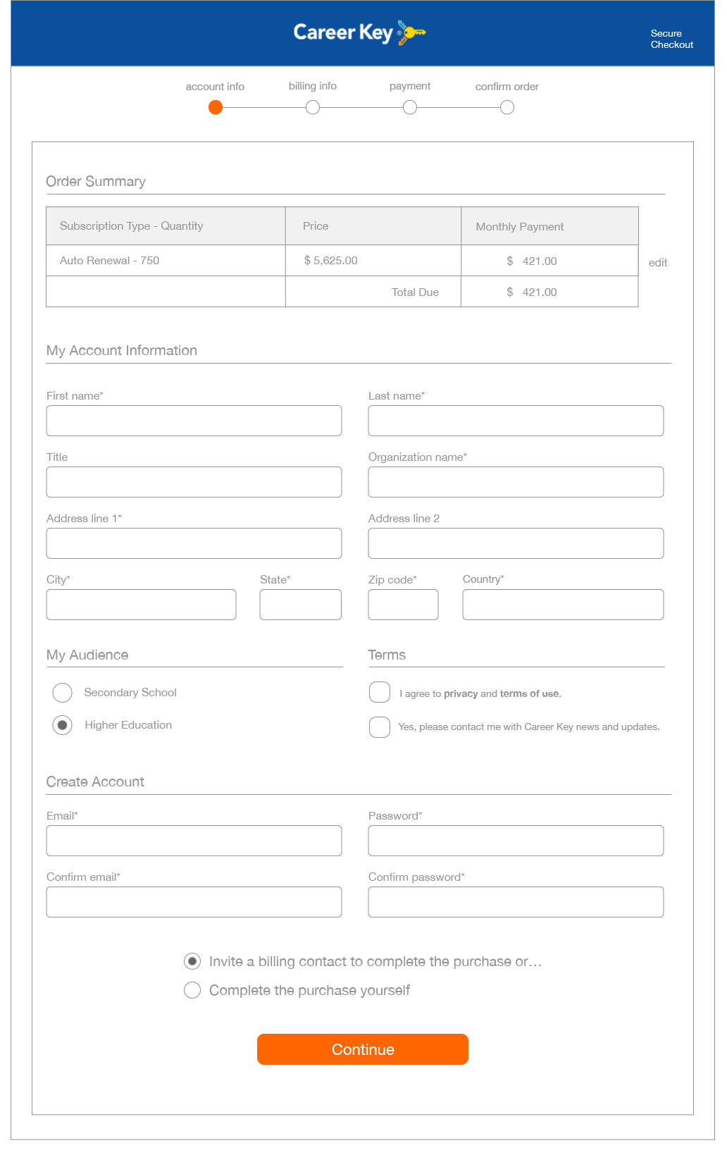
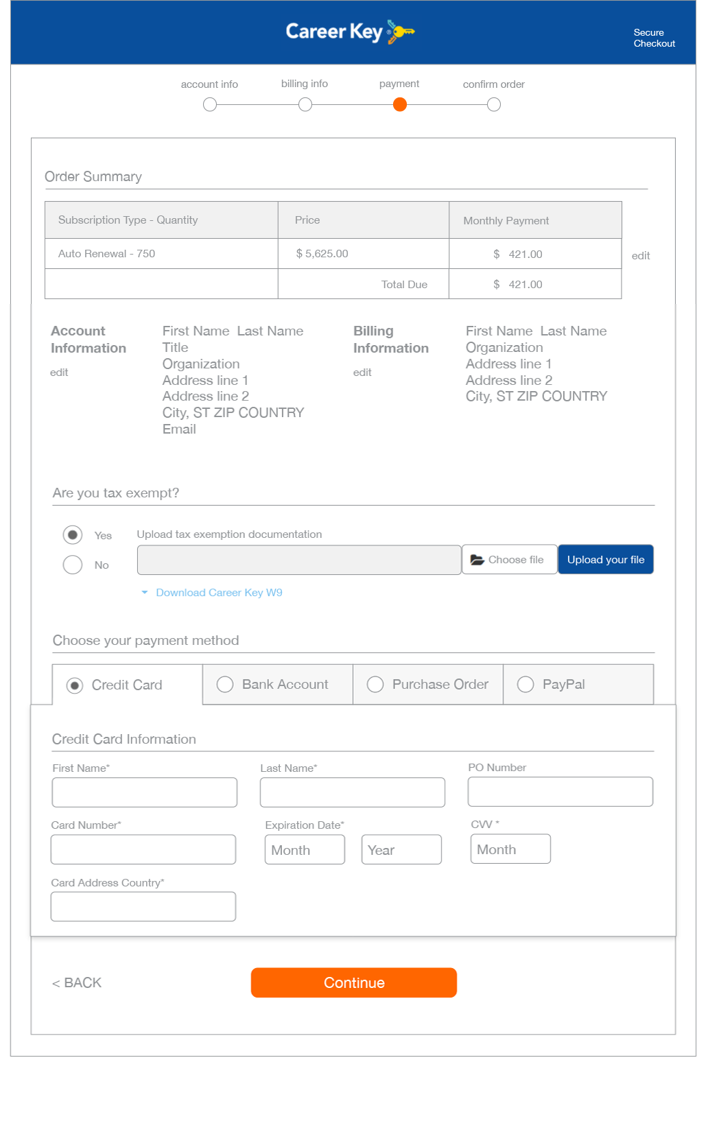
As usability testing was not in the budget, I guerrilla tested with friends. I didn’t use a formal script but gave them a user scenario and watched as they went through the flow. This highlighted a few places where clarity needed improvements.
Wireframe Iteration 02 - Artboard
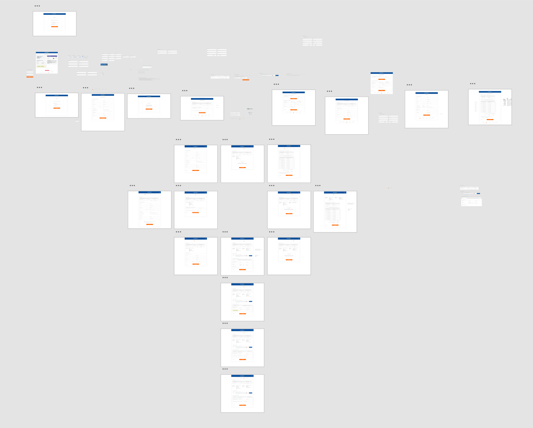
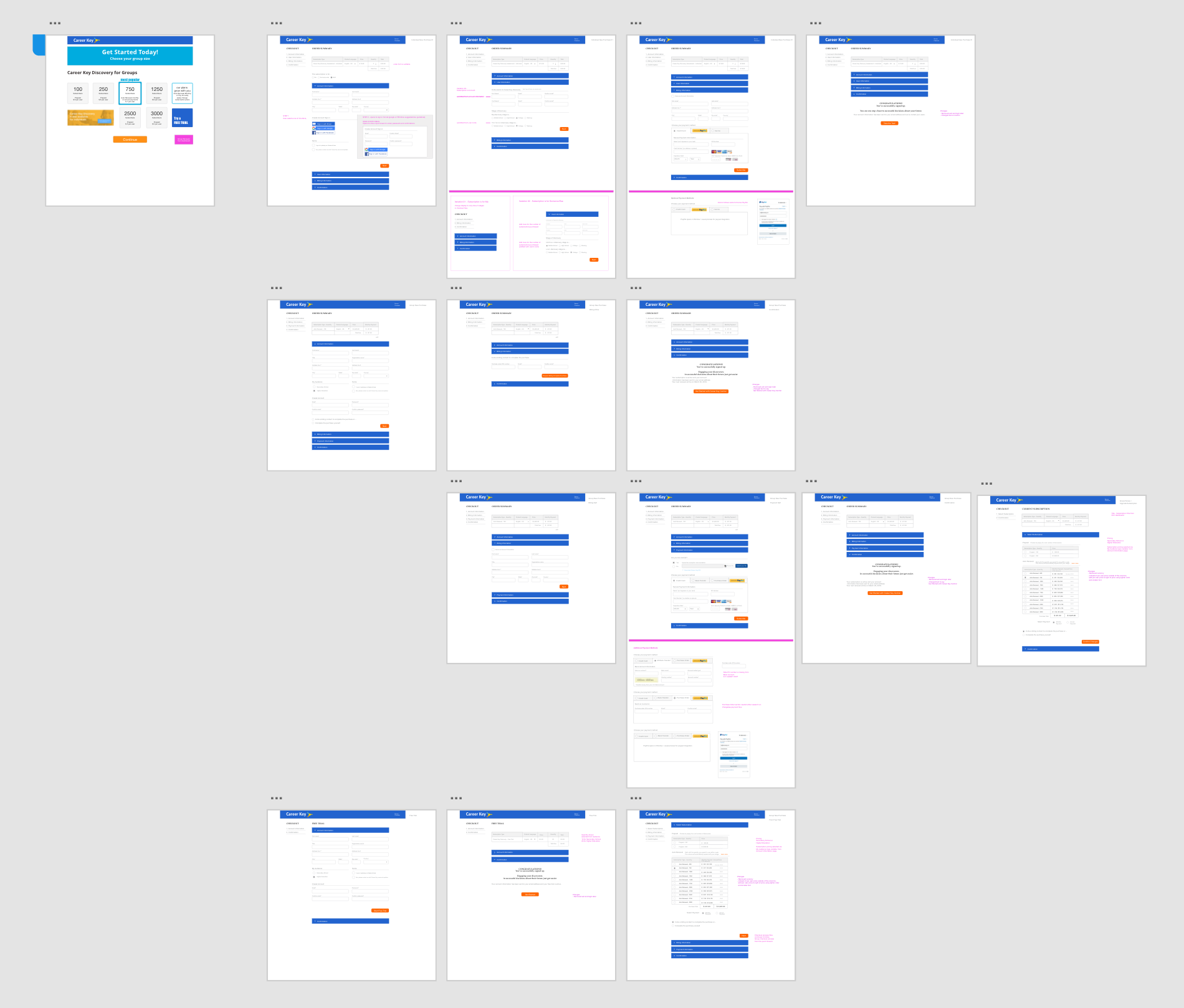
After having gone through two iterations wireframing, the client reported the development team was using a subscription management online solution, Chargebee. Rather than have the team custom develop the full design, I selected a template that most closely aligned with their needs and made modifications that the Nepalese development team would be able to easily implement.
Final Screens with Variations
Metrics
How effective was the change in UX? A blend of user rating systems along with qualitative feedback from user testing can give a better picture. Suggested metrics included Conversion, Customer Satisfaction Score and a Task Performance Indicator that looks more closely at how long it takes someone to check out under best practice situations. Does it take more than five minutes? Does the user feel confident while in the check out flow or do they feel insecure?
Outcome
A design was created that streamlined the payment process, improved the user experience, and saved the client money on development by utilizing the built-in capabilities of the payment platform.
Final Design - Account Information Page
